In Uzbekistan, citizens don't trust banks and financial institutions. Due to the high level of distrust and ignorance of the benefits of the service, the entire category of "equipment in installments" suffers. Moreover, the entire segment looks non-friendly and repulsive. Texnomart was one of them.
Problem
As a result, such services were unpopular among customers, and by 2016 only 0.5% of the 3 million population of Tashkent city has ever used equipment in installments. And all players compete for this 0.5 % of clients.
Challenge
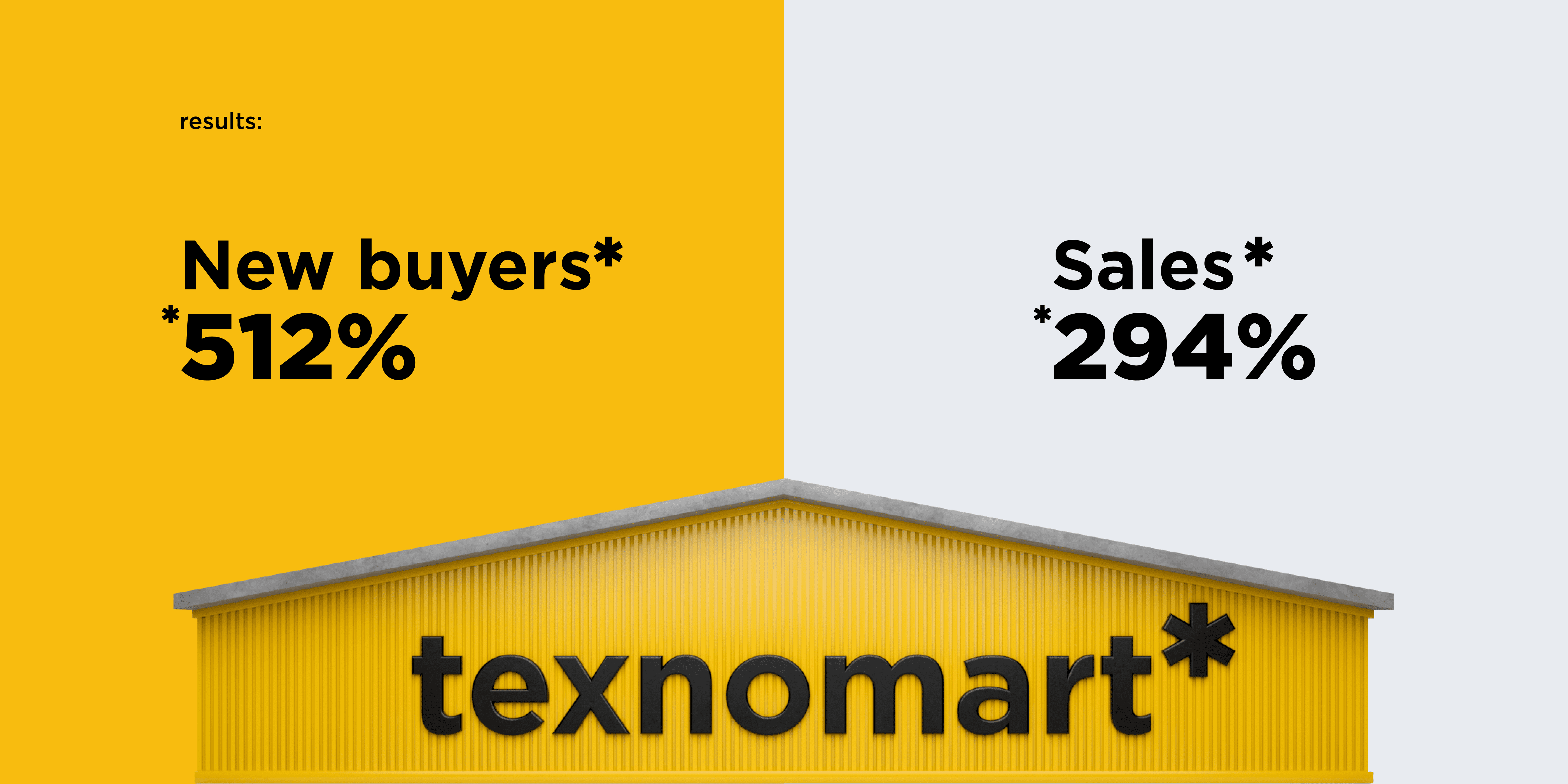
Change customer attitudes by communicating the benefits of installment payments. Over the next few years, become a leader in the installment category and expand the category as a whole.
Brand audit
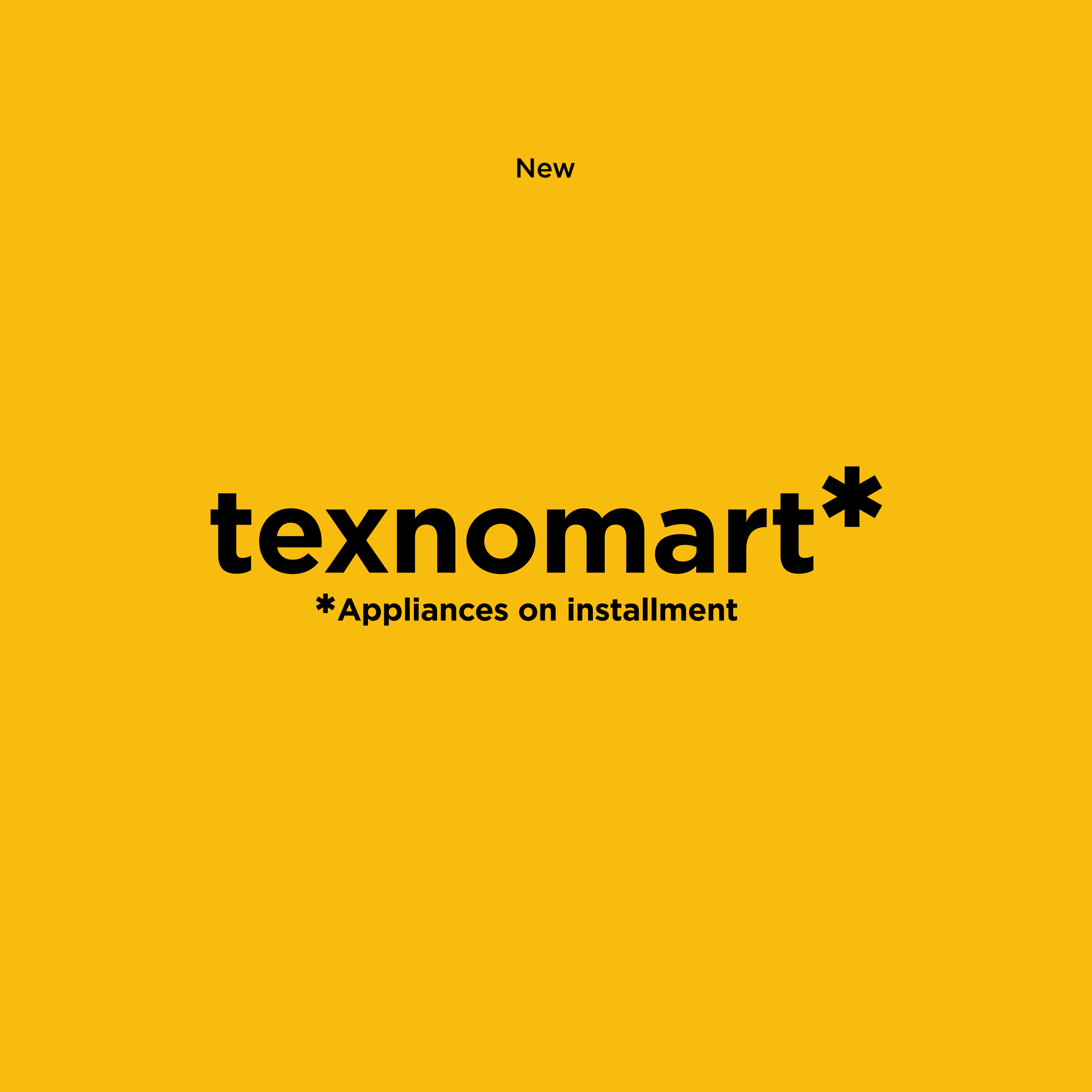
The descriptor "Retail chain" does not present any value for cosnumer. It was recommended to develop combined symbol with wording "Appliance in instalments" and use it as a trademark.
The previous color scheme doesn't get in line with brand positioning as simple and clear brand. These colors are being used by competitive companies as well. The color palette should be changed to more positive, people - friendly and differentiate brand from competitors.
The symbol of star doesn't reflect any brand essense and doesn't have any sophisticated meaning.
Capital letters as way of writing makes logo unreadable and irritates eye of consumer. The most powerful rebranding campaigns prove the fact that small letters are more suitable for people - oriented brands and shorten the gap between brand and consumer.
Solution
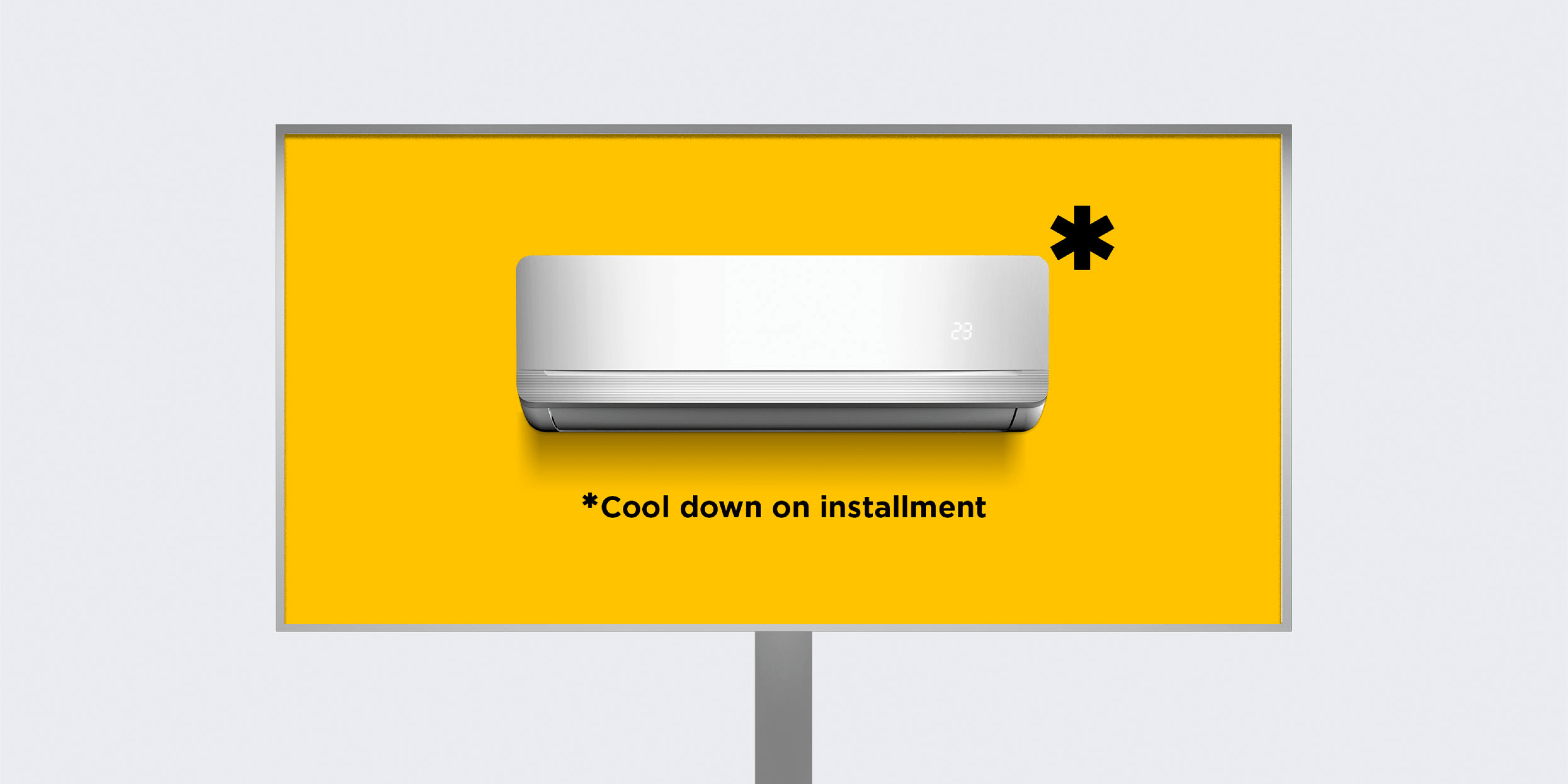
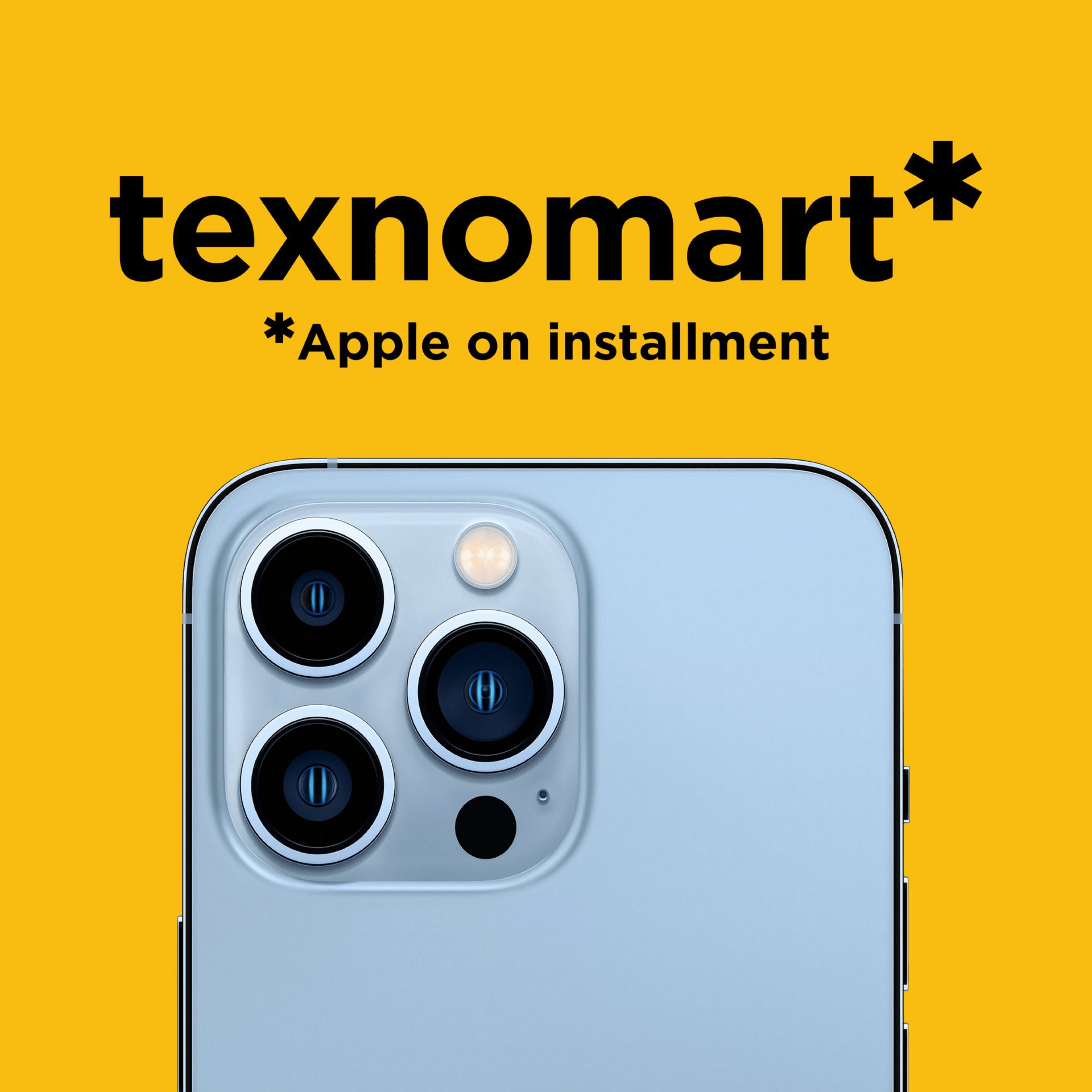
We changed everything: letters, colours, communication! We created the "star" indicator as asterisk (footnote) and it became the main element of communication. Showing the honesty of the brand in the instalment category and communication in general