InvestEngine was experiencing remarkable growth in the UK market, expanding its offerings and evolving into a major financial brand. At this importent moment, I was tasked with rethinking the brand's identity and communication design to better reflect its
Challenge
The challenge began with an in-depth exploration of the ETF market, setting the stage to create a fresh visual language. The project encompassed a full redesign, from crafting a new logo to developing a 3D brand identity seamlessly integrated into product and communication design.
Research
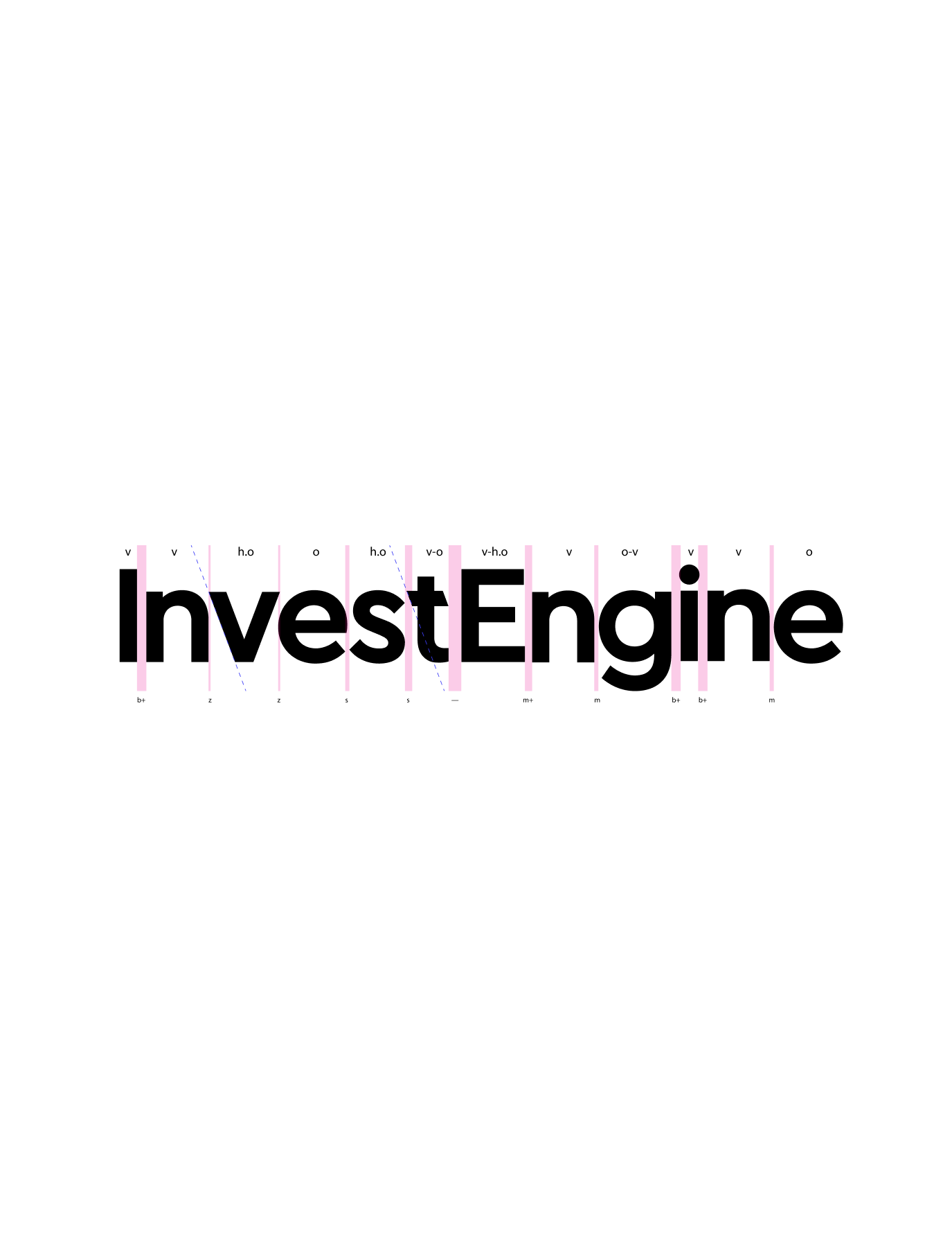
The first thing to do was to rethink the sign, which had a number of shortcomings the main one being the idea of which was not read by the audience and not memorised.
Insperation
I found inspiration in the archaic and archetypal image of Perseus' sandals when creating the sign. It is a symbolism of the movement that is perfectly suit to the sign. Such images go through culture and make the sign very strong in perception
InvestEngine has a telling name which prompted me to look at automotive brands. So I saw in the famous BMW M-series symbol the line chart, which has become a signature device in the brand's identity.
Solution
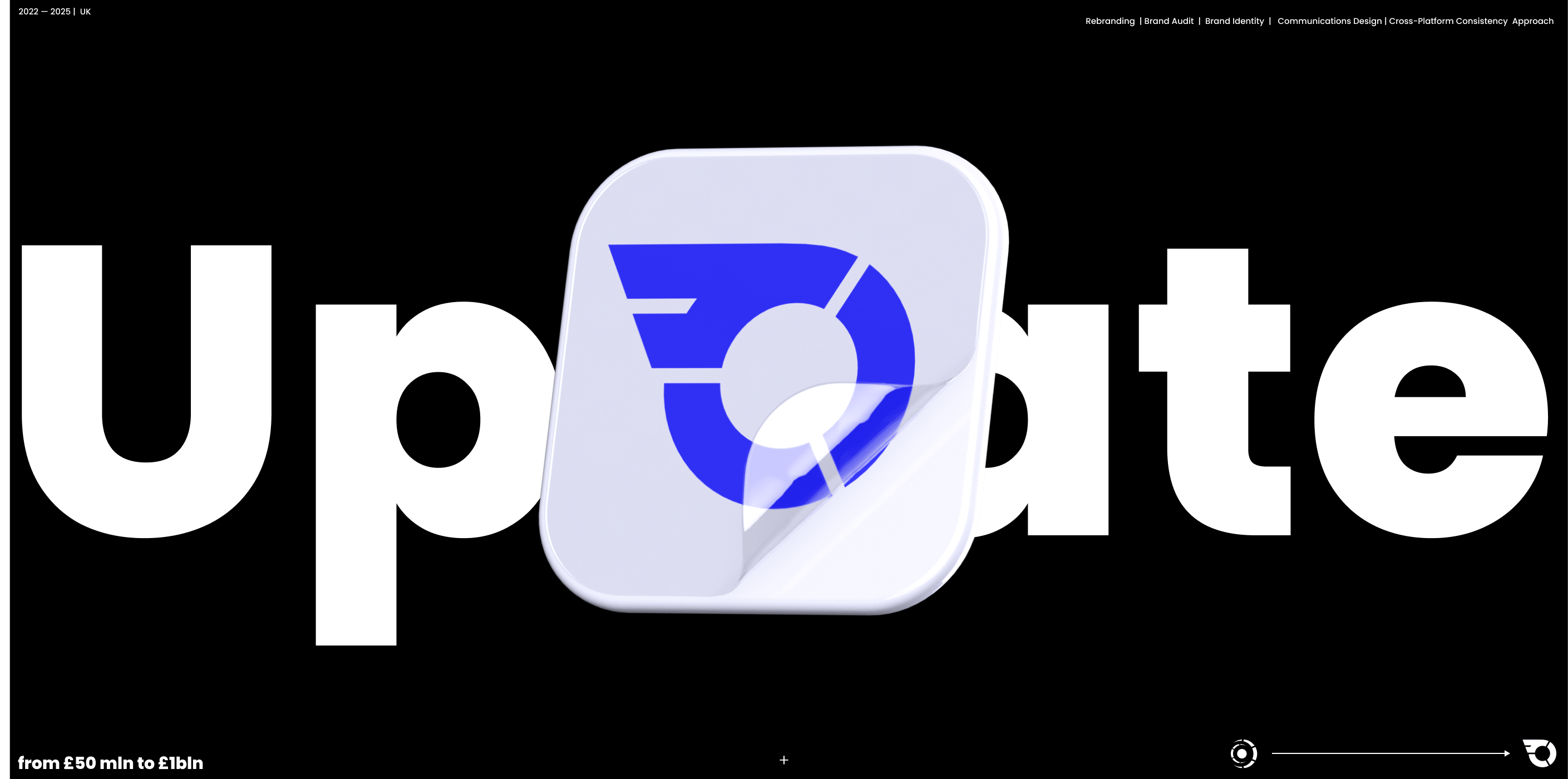
The new mark perfectly captures the spirit of the brand with the fusion of the pie chart as a symbol of finacial (ETF portfolio) and the wing/lines as a symbol of movement. This simple yet powerful symbol passed the “repetition test,” ensuring people could easily recall and replicate it
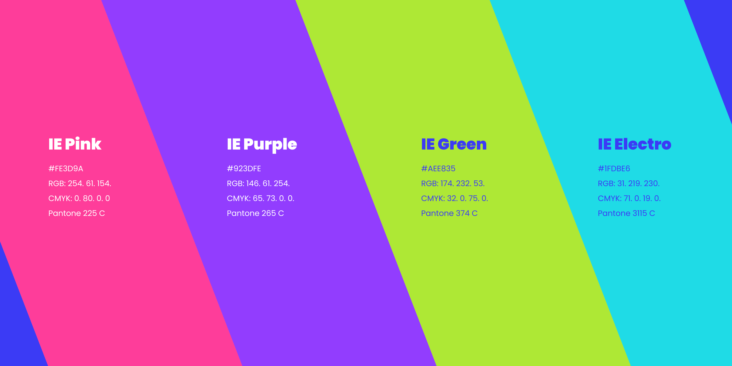
The brand palette was updated to brighter and bolder colours on the basis of which were developed branded 3D materials with a texture close to polished aluminium like Apple's creating a pleasant tactile feeling, such a unity of style allows you to mix graphics for a variety of tasks without loss of identity.
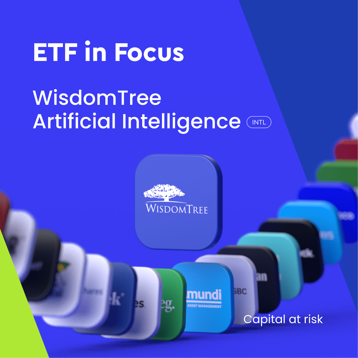
The new great find was the 3D logo. Which is like a fantastic investment ship that enhances the technological perception of the brand and allows you to quickly create different scenes with different plots in the branded 3D style.
Result
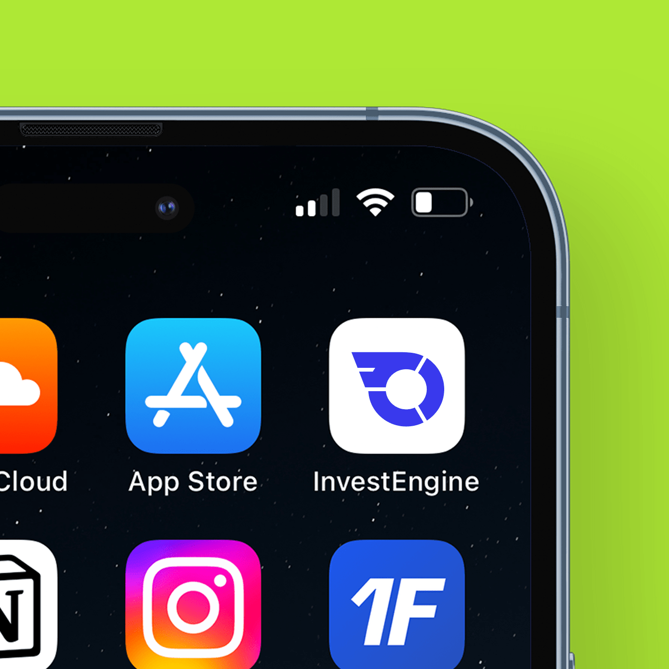
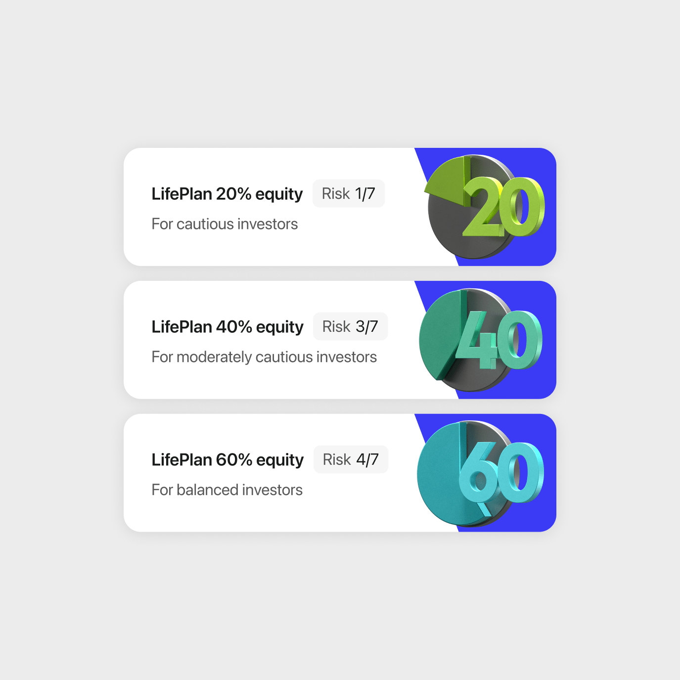
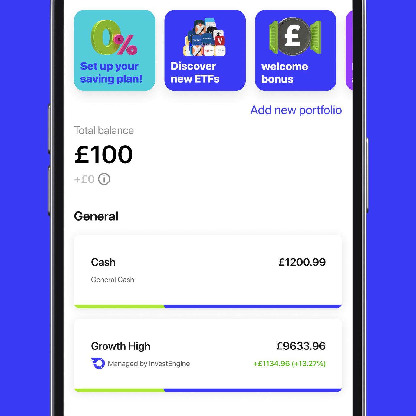
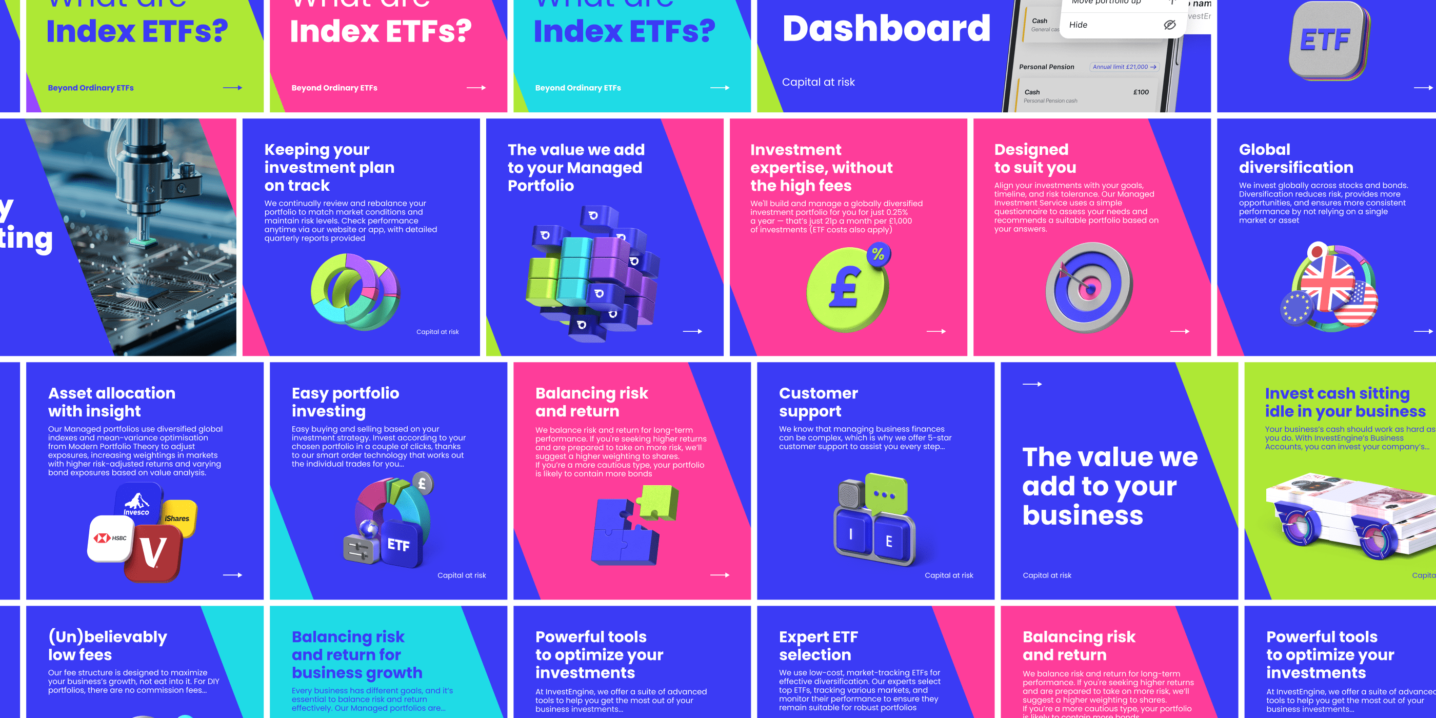
The corporate identity has been realised through all components of the brand. The identity is organically found on the whole way of interaction with the user
I think when creating this corporate identity, we were among the first to develop standards and principles of such a new direction in design as 3D branding.